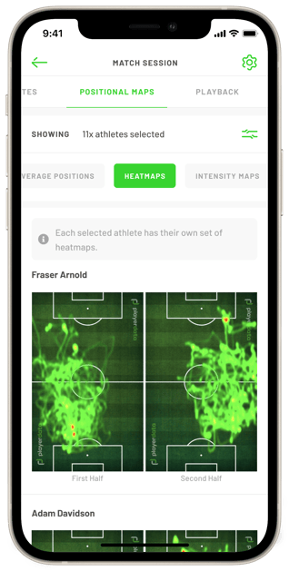
Heat Maps show you where you have spent most of your time during a match the closer to red you are the more time you’ve spent in that area.
What is a Heat Map?
Heat Maps are a great tool to help visualise where the team and individual athletes have spent the most time during a match. Heat Maps work on a colour scale starting at green, which signals the least time spent in that area and ending at red which signals the most time spent in that area.
 Benefits
Heat Maps are great at creating conversations between coaches and players looking at how they achieved the teams tactical goals in a match. A good example would be playing a midfield diamond in football should be represented with a lot of red in the centre of the map.
Where to find your Heat Map
Heat Maps can be found using the following steps:
- Select the match you wish to view and click "see full match details"
- Swipe the top scroll bar and select "Positional maps".
You can then select individual or multiple players and compare their heat maps to each other.